
Complementary Colors: The Ultimate Guide in 2024 for User Experience
by uiuxadmin in User Experience on December 15, 2023Get ready to unlock the vibrancy of color and elevate your user experience in 2024! This guide dives deep into the world of complementary colors, showcasing their potential to enhance your interfaces and boost engagement.
Why Complementary Colors Matter for UX in 2024:
- Attention-grabbing contrast: In a world saturated with digital content, complementary colors help your interfaces stand out. Their contrasting hues naturally draw the eye, guiding users through key elements and improving scannability.
- Dynamic and engaging experiences: The inherent tension between complementary colors creates a sense of visual dynamism, making your interfaces feel alive and engaging. This is especially crucial in 2024 when users crave immersive and interactive experiences.
- Emotional resonance: Different complementary pairs evoke specific emotions, allowing you to influence user perception and engagement. Warm tones like orange and yellow can energize and motivate, while cool shades like blue and green can promote focus and trust. Consider tailoring your palette based on your target audience and brand personality.
- Accessibility focus in 2024: With inclusivity becoming increasingly important, high contrast between complementary colors ensures better readability for users with visual impairments. Choosing accessible color combinations is not just ethical, but also essential for reaching a wider audience in 2024.
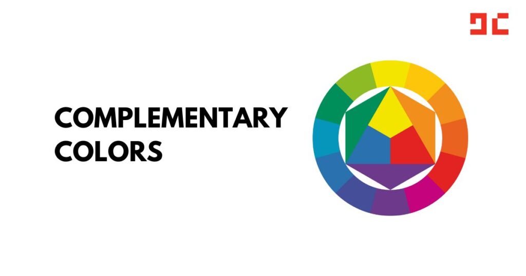
Navigating the Spectrum:
- Classic pairings: Red-green, yellow-purple, and blue-orange are timeless options that offer high contrast and visual impact. These tried-and-true combinations are a safe bet for making a bold statement.
- Split complements: For a softer and more nuanced contrast, explore colors adjacent to the direct complement. This approach adds depth and complexity to your palette, making it ideal for modern and sophisticated interfaces.
- Tints and shades: Play with varying saturation levels of complementary colors to create subtle transitions and depth within your design. This technique can add visual interest and guide user attention.
UX Applications for 2024:
- Interactive elements: Implement dynamic color changes on hover or click states using complementary colors. This provides visual feedback and enhances user engagement with interactive features.
- Data visualization: Utilize complementary colors to differentiate data points and trends in charts and graphs. This improves clarity and comprehension for users, especially in data-driven 2024 experiences.
- Personalization: Consider offering users the ability to choose their preferred color combination, catering to individual preferences and fostering a sense of ownership. This trend of personalization will be increasingly important in 2024 user experiences.
- Microinteractions: Use subtle animations and transitions between complementary colors to create delightful microinteractions. These small touches can elevate the overall user experience and make your interface feel more polished and modern.
Pro Tips for 2024:
- Balance is key: Avoid using both colors equally to prevent overwhelming users. Choose one as dominant and the other as an accent for a harmonious and effective composition.
- Context matters: Tailor your color choices to the content and purpose of your interface. For example, an educational platform might benefit from calming blue-green tones, while a fitness app might thrive with energizing orange-teal pairings.
- Accessibility first: Ensure your chosen complementary color combination meets WCAG accessibility guidelines to guarantee optimal usability for all users. This is non-negotiable in 2024 with accessibility becoming a top priority.
- Test and iterate: Get feedback from users to see how your color choices impact their experience. Be willing to adjust and refine your palette based on user research for optimal results.
Embrace the vibrancy of complementary colors and watch your user experience soar in 2024! Remember, the key is to find the balance that resonates with your brand and audience while prioritizing accessibility and user engagement. By leveraging these powerful color duos, you can create interfaces that are not only visually stunning but also intuitive and enjoyable to use.